The Dardi Shades
The Dardi Shades
As good friends of mine, The Dardi Shades came to me for a bit of help to brand them and come up with a cover design for their first single, Bullets.
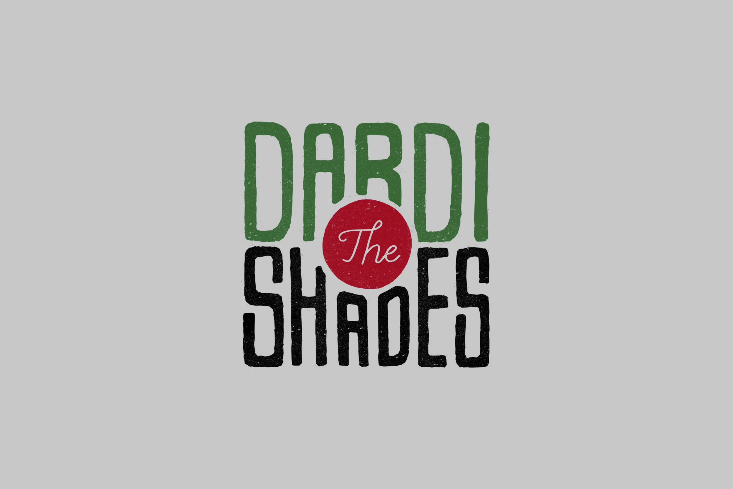
The final logo nods very subtly to a bullseye (Dardi is Italian for Dart). The design, colour palette and typeface gives The Dardi Shades a recognisable, visual voice. Of late night pool halls, and taverns draped in booze.


Concept development
The brief was very open and loose, so I got cracking in a few different directions but thought the style of the logo should revolve around a hand-drawn style. Their music has a rawness to it that I wanted to capture in the loose hand drawn style. Unfortunately, it was the wrong direction.

Bullets Single Release
With a very limited budget, I thought a playful approach towards a serious word for the cover solution matched the guys vision for the song. I created a system using the pink circle as a bulls eye for all future releases, creating an instantly recognisable visual language.

Client: The Dardi Shades
Designer: Tim King
Creative Direction: Tim King, Stew Patterson
Photography: James Simpson (no relation to Bart and Lisa) & Alex Hitchins


